
Introduction
A fashion ecommerce brand asked us to look at their site expecting a conversation about visuals, a fresher homepage banner, maybe a new font. What we found instead was a store that looked genuinely good in screenshots and quietly frustrated anyone actually trying to buy something on it.
Client: Withheld at client's request

Sector: Fashion Ecommerce (D2C, Women's Contemporary Wear)

 Engagement: 5 months (build + 1 month post-launch tuning)

 Service: Website Development & Conversion Design
Background & Context
The brand ran around 350 SKUs across dresses, separates, and accessories, sold entirely direct-to-consumer, and had a site that was roughly three years old, built on a template that had been customized piece by piece over time without ever being properly reviewed as a whole. Traffic was healthy, largely from social and a growing ad account. Conversion just wasn’t keeping pace with it.
When we sat with their founder and actually shopped the site start to finish on a phone, a few things became obvious fast. Size selection required a separate popup that didn’t always load properly. Cart updates didn’t reflect immediately, so people were clicking “add to cart” twice, unsure if it had worked the first time. And checkout asked for the same shipping information twice, once at cart and again at the payment step, for no clear reason anyone could explain.
Challenges
The size and fit experience was the biggest single issue. There was no consistent size chart across products, some had one, most didn’t, and the ones that existed used a generic chart not specific to that garment’s actual cut. For fashion, where fit uncertainty is one of the main reasons people abandon a purchase, this was a real gap, and it was probably driving a meaningful share of returns too, though that wasn’t something we were tracking initially.
Checkout itself had more friction than it needed. Guest checkout existed but wasn’t the default, so people were being nudged toward creating an account before they’d even decided to buy anything, a well-documented way to lose someone at the last step. Combined with the duplicate shipping form, it added up to a genuinely long path from “add to cart” to “order placed.”
Product photography was good, but the gallery only showed the product laid flat or on one model, no sense of how it looked on different body types or in motion, which left a lot of the decision-making work undone for the shopper.
And on the technical side, the site slowed down considerably during sale periods, the exact moments when speed and reliability mattered most, because the hosting setup hadn’t been built with traffic spikes in mind.
Approach, Strategy & Solution
We rebuilt the size guidance first, since it touched almost every other conversion problem downstream. Each product category got a fit-specific size chart, embedded directly on the page rather than behind a popup, along with a short fit note where relevant, “runs slightly fitted, size up if between sizes,” the kind of practical detail that actually reduces hesitation instead of just decorating the page.

Checkout got compressed into a single page with guest checkout as the default, account creation offered only after the order was placed, not required beforehand. We removed the duplicate shipping entry and added a persistent order summary so people could see exactly what they were paying for at every step, rather than discovering shipping costs for the first time at the very end.
Product galleries got expanded to include on-model shots where the brand had them, and we worked with their photography team to prioritize at least one on-model image per new product going forward, since it wasn’t going to fix itself without becoming part of the actual production process.
We also moved hosting to infrastructure built to handle traffic spikes without degrading, tested specifically against the load levels their previous sale periods had shown, so speed held steady instead of falling apart exactly when it mattered most.
Results
Five months to build and launch, then a month of tuning based on real shopper behavior once traffic started flowing through the new flow, including one sale period that served as a genuine stress test.
Result Summary
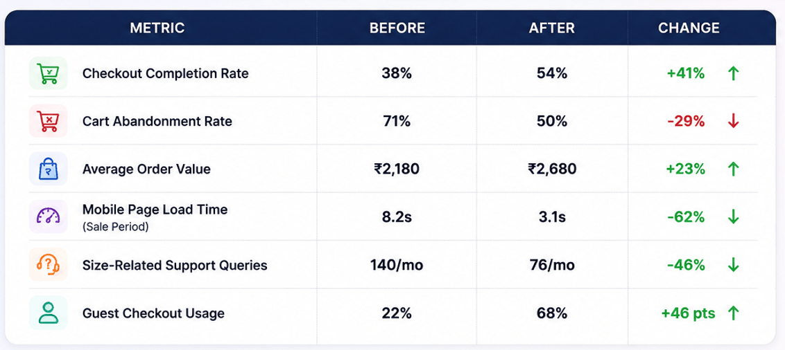
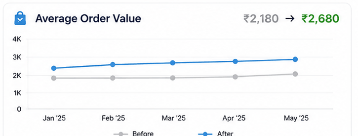
We Increased Average Order Value by 23%
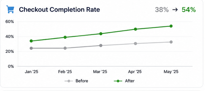
We Increased Checkout Completion Rate 38% to 54%
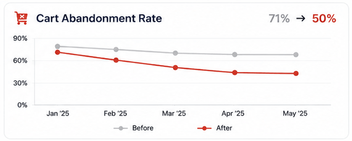
We Reduced Cart Abandonment by 29%
We Improved Mobile Page Speed by 62%

Their customer support lead mentioned that fit-related questions, which used to be one of the most common message categories, dropped off noticeably within the first few weeks, and that the ones still coming in tended to be about specific edge cases rather than basic confusion about what size to order.
Conclusion
The site wasn’t ugly and it wasn’t broken in any way that would show up in a quick glance. It was just full of small, accumulated friction, an extra popup here, a duplicate form field there, a missing size chart on this one category, none of it dramatic on its own, all of it adding up to people quietly giving up before finishing a purchase they’d already decided to make.
Curious What This Would Look Like for Your Brand?
We’ll walk through your current checkout and product experience for free, no changes made, just an honest look at where shoppers are actually getting stuck.
Ask us for a free ecommerce UX audit →
Why Fashion Brands End Up Working With Arihant Global
We shop your own site the way a real customer would before we touch anything. Fit and sizing get treated as a conversion problem, not just a content afterthought. Checkout gets built around fewer steps, not more fields to collect. And we’d rather fix the friction nobody’s noticed yet than redesign a homepage that was never really the problem.
Disclaimer
This case study highlights the outcomes of a specific website development project. Results may vary based on factors such as business goals, market conditions, website structure, audience behavior, technology platform, and ongoing optimization efforts.