How WhatsApp Marketing Helped a Healthcare Clinic Cut Missed Appointments
Executive Summary
Client Industry: Healthcare Outpatient Clinic and Specialist Practice
Primary Challenge
Every week, confirmed appointments were quietly disappearing, and nobody at the clinic had a real way to stop it. Patients forgot they’d booked, turned up on the wrong day, or didn’t come at all often without any warning. The front desk was running everything off phone calls and a paper register, with no consistent way to remind people or track who was actually coming in.
Arihant Global’s Solution
We built a WhatsApp marketing and communication system designed around how the clinic already worked, not against it. Patients got instant booking confirmations, reminders landed at the right moments, and confirming, rescheduling, or cancelling an appointment became as easy as replying to a text. No more missed calls. No more front desk staff chasing people down between patients.
Key Measurable Outcomes
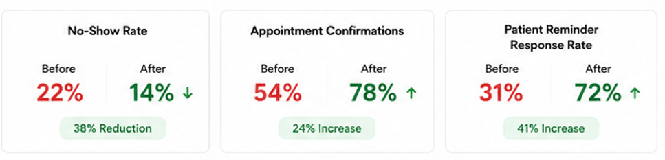
Missed appointments dropped by 38% within 3 months
Confirmation rate climbed from 54% to 78%
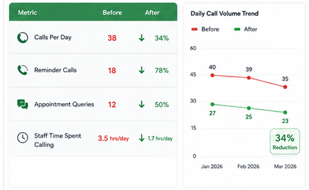
Front desk call volume fell by 34%
Seven out of ten patients responded to WhatsApp reminders
Background and Context
The client runs a specialist outpatient clinic that has been treating patients for over six years, covering general medicine and chronic disease management. It’s a busy practice the doctor sees between 20 and 28 patients a day, five days a week. But the appointment process itself hadn’t changed since the clinic opened. Patients called in to book, the front desk logged it in a register by hand, and someone would try to call and remind them the day before, if there was time. Most days, there wasn’t. The result was a no-show rate stuck around 22% of confirmed appointments, month after month slots the doctor and staff were ready to fill that patients simply never showed up for.
This is the exact gap that WhatsApp marketing is built to close. It’s not about running promotions or blasting offers for a clinic, it’s about using a channel patients already check constantly to keep them informed, engaged, and accountable to their own appointments.
Challenges
- No-show rate sitting at roughly 22% of confirmed appointments, week after week
- The only reminder system in place was an occasional phone call the day before inconsistent, and a drain on front desk time
- Patients who wanted to reschedule had no easy way to do it without calling during busy hours, so many just skipped the appointment instead
- Front desk staff were spending a large chunk of their day on booking calls, reminder calls, and follow-ups instead of helping patients who were physically in the clinic
- No way to track who had confirmed, who hadn’t responded, and who had cancelled everything lived in a paper register
- Last-minute cancellations weren’t reaching the clinic early enough to offer the freed-up slot to another patient
- Patient phone numbers were collected at registration but had never been used for any real communication beyond the odd reminder call
Approach, Strategy and Solution
We rolled this out over three months, with each phase building directly on the one before it, so the clinic ended up with a complete WhatsApp marketing and appointment management system rather than a patchwork of quick fixes.
Month 1: Audit, Setup and WhatsApp Business Configuration
We started by mapping out exactly how the existing process worked how bookings were taken, how (or if) reminders went out, where in the process no-shows were happening most, and which types of patients were least likely to confirm or show up. From there, we set up WhatsApp Business properly for the clinic. a verified Google business profile, accurate clinic details, listed consultation hours, and a professional greeting message that set the right tone from the first interaction. We also built a contact database from the clinic’s existing registration records, pulling in every patient with a mobile number on file and tagging each one with their appointment history.
Month 2: Automated Reminder Sequence and Booking Flow
This is where the WhatsApp marketing engine really came together. Every patient now receives a booking confirmation on WhatsApp the moment they schedule an appointment date, time, doctor’s name, and what to bring. A second message goes out 24 hours before the appointment, asking for a quick reply to confirm attendance. If there’s still no response, a final reminder lands two hours before the appointment. Every single one of these messages includes a simple way to reschedule or cancel by replying directly, removing the old barrier of having to call during clinic hours. If a patient cancels more than 12 hours out, the front desk gets an automatic alert so that slot can be offered to someone on the waiting list instead of sitting empty.
Month 3: Two-Way Communication and Performance Review
By the third month, the system could handle bookings coming the other way too. A patient could message the clinic’s WhatsApp number directly, and a guided flow would collect their name, preferred date, and reason for the visit before the front desk confirmed availability and sent back a formal booking confirmation. We also reviewed three months of appointment data to see which reminder touchpoints were driving the strongest confirmation rates, and whether particular patient groups needed extra follow-up. A few adjustments to message timing and wording followed, based directly on what the numbers showed was working.
Results
The change showed up first in how the front desk was spending its time. Within the first month, outbound reminder calls dropped noticeably, and for the first time in over a year, the no-show rate started moving downward instead of holding steady.
| Metric | Before | After |
| Monthly No-Show Rate | 22% of confirmed appointments | 14% of confirmed appointments |
| Appointment Confirmation Rate | 54% | 78% |
| Front Desk Call Volume per Day | 38 calls per day | 25 calls per day |
| Patient Response Rate to Reminders | Not measured | 72% |
| Cancellations Rescheduled vs Lost | Under 20% rescheduled | 44% rescheduled |
| Monthly Revenue Lost to No-Shows | Rs. 28,000 per month | Rs. 19,320 per month |
We Increased Patient Confirmations by 24% & Reduced No-Shows by 14%
We Reduced Front Desk Calls by 34%
Conclusion
The clinic wasn’t losing appointments because patients didn’t want to show up. It was losing them because there was no system making it easy for patients to confirm, reschedule, or flag a cancellation in time for that slot to be reused. Arihant Global built that system through a structured WhatsApp marketing approach in just three months. Missed appointments fell by 38%, confirmation rates jumped from 54% to 78%, and the front desk got a meaningful chunk of their day back from outbound calls. Revenue that had been quietly slipping away through empty slots started flowing back in. If your clinic runs a full schedule and loses a predictable slice of it every week to no-shows, the fix is a lot simpler than most clinic owners assume.
Talk to Arihant Global about what a WhatsApp marketing and appointment system could look like for your practice, and what a realistic drop in no-shows could mean for your monthly revenue.
Why Businesses Choose Arihant Global
Healthcare clinics turn to Arihant Global for WhatsApp marketing because no-shows are a revenue problem that compounds week after week, and fixing it doesn’t require expensive software or tearing up how the clinic already runs. Patients already have WhatsApp open on their phones every day the right setup, the right message sequence, and genuine two-way communication is usually all it takes to bring the no-show rate down in a real, lasting way. We design systems that fit into how a clinic already operates, rather than asking the whole team to change everything at once.
Disclaimer
Results reflect outcomes achieved for a specific client based on their patient volume and clinic setup. Individual results may vary depending on practice size, patient demographics, and implementation approach.

Healthcare Digital Marketing: How a Traditional Hospital Increased Online Appointments by 176%

Executive Summary
There’s a particular kind of confidence that comes with being the hospital everyone in town already knows. Good reputation, decades of trust, doctors people would drive an hour to see. That was exactly this client’s situation a well-established multi-specialty hospital that had built its name almost entirely on word-of-mouth and years of being the reliable option in the region. The problem was, that reputation had quietly stopped translating into anything online. Someone searching “best cardiologist near me” or “maternity hospital with NICU” in their own city wouldn’t find them at all. They’d find three competitors who’d invested in digital years earlier.
We came into this one knowing it wasn’t really a Digital marketing project in the usual sense. It was closer to a full identity shift helping a hospital that had always operated like a traditional institution start behaving, at least online, like a modern healthcare brand people could discover, trust, and book with, without ever setting foot inside until their appointment.
Results Snapshot
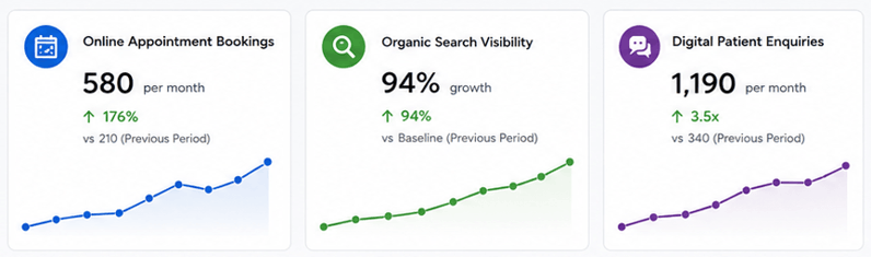
176% Increase in online appointment bookings
94% Growth in organic search visibility
3.5x More patient enquiries through digital channels
58% Increase in branded search volume
Background and Context
The hospital had been operating for over two decades and had genuinely earned its reputation the hard way good outcomes, good doctors, referrals that kept coming from satisfied patients telling their families and neighbors. But almost none of that trust existed online. The website looked like it hadn’t been touched since it was first built, department pages were outdated or missing entirely, and there was no way to book an appointment without calling the front desk during office hours.
Meanwhile, patient behavior had shifted in ways the hospital hadn’t quite caught up with. People weren’t just asking their neighbor which hospital to go to anymore they were googling symptoms at 11pm, comparing doctor credentials online, reading reviews before deciding where to walk in. And in that search, this hospital was practically invisible next to competitors with far shorter track records but far better websites.
The Challenges
Once we got into it, the gap between the hospital’s real-world reputation and its digital presence became pretty stark. The website wasn’t mobile-friendly, which mattered enormously since most patient searches were happening on phones, often in a moment of genuine worry or urgency. There was no appointment booking system online at all every enquiry had to go through a phone call, which is a real barrier for anyone searching outside office hours or hesitant to call a stranger about a health concern. Individual doctors had almost no online presence, so patients couldn’t research credentials or specialties before deciding who to see. Google Business listings for different departments were inconsistent or missing. And there was essentially no content addressing the actual questions patients search before choosing a hospital things like “what to expect during a knee replacement” or “signs you need to see a cardiologist,” the exact searches that build trust before someone ever calls.
Approach and Strategy
Phase 1: Foundational Digital Presence (Days 1–20)
Before anything else, the hospital needed a website that actually worked the way patients expect a website to work in 2026 fast, mobile-friendly, and easy to navigate to a specific department or doctor without digging through five menus. We rebuilt the core site structure, cleaned up department pages, and made sure basic information like hours, locations, and emergency contact numbers were impossible to miss.
Phase 2: Online Appointment Booking (Days 15–35, overlapping)
This was probably the single highest-impact change in the entire project. We implemented an online booking system that let patients choose a department, pick a doctor, and book a slot without ever picking up the phone. For a hospital that had relied entirely on calls for years, this alone opened up a huge chunk of patients who’d rather book quietly online than talk to someone, especially for sensitive appointments.
Phase 3: Doctor Profiles and Healthcare SEO (Days 30–55)
We built out individual, properly optimized profile pages for the hospital’s doctors credentials, specialties, patient-facing explanations of what conditions they treat, written in language a worried patient would actually understand rather than clinical jargon nobody outside the field uses. Each department got its own dedicated content and search strategy, so searches like “pediatric orthopedic specialist” or “best maternity care” in the hospital’s city had somewhere real to land.
Phase 4: Trust-Building Healthcare Content and Patient Education (Days 45–75, overlapping)
Healthcare Digital marketing decisions involve a lot of anxiety, and people research heavily before committing to a hospital, especially for anything beyond a routine checkup. We built out genuinely useful content answering the questions patients actually search what to expect before a procedure, recovery timelines, when a symptom warrants a visit versus a wait-and-see approach. This is also where getting E-E-A-T right mattered enormously, since medical content carries real weight with both patients and Google when it comes from credentialed sources.
Phase 5: Google Business Profile and Local Search Cleanup (Days 50–70)
We consolidated and properly optimized Google Business listings across all departments and locations, added real patient reviews into the process, and made sure someone searching for urgent care or a specific specialty nearby would actually find accurate, consistent information instead of outdated listings pointing to the wrong building.
Phase 6: Digital PR and Reputation Building (Days 60–90)
To build the kind of authority search engines and patients both respond to, we worked on getting the hospital’s specialists featured in local health publications and community coverage, turning offline credibility the hospital already had into something that showed up online too.
Results
| Metric | Before | After |
| Online appointment bookings/month | 210 | 580 |
| Organic search visibility | Baseline | +94% |
| Digital patient enquiries/month | 340 | 1,190 |
| Branded search volume | Baseline | +58% |
| Website mobile traffic | 41% of total | 68% of total |
| Average appointment booking time | Phone only, business hours | Under 3 minutes, anytime |
We Increased Appointments, Search Visibility and Patient Enquiries By Healthcare Marketing
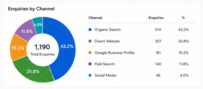
Overall Performance
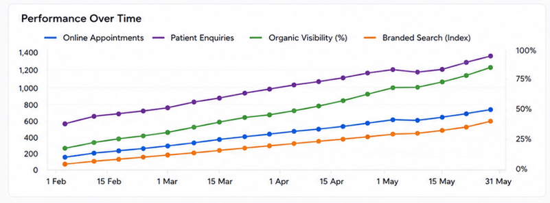
What stood out most to the hospital’s own team wasn’t just the booking numbers it was watching patients arrive already having researched their doctor, read up on their procedure, and formed a sense of trust before ever walking through the door. That changed the tone of a lot of first consultations in a genuinely noticeable way.
Conclusion
This project was really about closing the gap between two things that should’ve matched but didn’t a hospital that had earned real trust in its community over two decades, and a digital presence that gave none of that trust anywhere to live online. Rebuilding the website, making appointments something a patient could book at midnight instead of only during office hours, giving doctors a real online identity, and creating content that actually answers what worried patients are searching that combination is what turned years of offline reputation into something people could finally find, believe, and act on before they ever needed to make a phone call.
Want your hospital or clinic to show up the way your reputation actually deserves?
Talk to Arihant Global about building a digital healthcare presence patients can find, trust, and book with.
Why Businesses Choose Arihant Global
Healthcare Digital marketing isn’t like marketing anything else the stakes are personal, the trust bar is higher, and the wrong tone or a broken booking flow can genuinely cost someone care they need. Arihant Global builds digital strategies for hospitals and healthcare marketing providers that respect that difference: real patient-focused content, doctor profiles people actually trust, and booking systems that remove friction instead of adding to it. The goal isn’t just more website traffic it’s turning decades of earned reputation into something patients can find and act on the moment they need care.
Disclaimer
Results reflect this client’s specific market and circumstances. Digital marketing outcomes vary based on competition, region, budget, and execution, and past performance doesn’t guarantee similar results for other businesses.

How Educational Content Marketing Improved Brand Trust

Executive Summary
There’s a trap a lot of brands fall into once they’ve been around long enough every single piece of content starts sounding like a pitch. Every blog post ends with a call to action, every social post is quietly trying to sell something, and at some point, without anyone really noticing, the audience just stops listening. That was more or less where this client landed. A financial services and investment advisory firm with a genuinely solid existing client base, but newer visitors kept bouncing off their content because, honestly, it read like an ad no matter what it claimed to be about.
We came in to help them rework their whole approach to content build things that actually taught people something, without a sales angle wedged into every paragraph. It felt genuinely risky to them at first. Publishing content that didn’t push a product felt, to them, like giving something away for nothing. But that’s exactly the thing that started rebuilding the trust that had been quietly leaking away for a while.
Results Snapshot
112% Increase in returning website visitors
64% Growth in newsletter subscribers
2.9x Increase in time spent on content pages
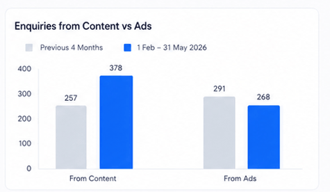
47% Rise in inbound enquiries from content, not ads
Background and Context
The client had been publishing content for years, and almost all of it followed the same shape a thin explanation of some financial concept, followed almost immediately by a pitch for their advisory services. Not dishonest, exactly. Just obviously self-interested in a way people picked up on pretty fast, even if they couldn’t quite say why a piece felt off. New visitors would read one or two articles, sense where it was heading, and quietly never come back.
Meanwhile, some of their competitors, particularly the newer fintech-style brands, had built genuinely loyal followings by publishing content that helped people actually understand money without trying to close a deal in the same breath. The client could feel that gap even before we put numbers to it people would sit through a first consultation still visibly guarded, asking questions that made it pretty clear they hadn’t fully bought into the advice yet, even after they’d walked through the door.
The Challenges
Once we dug into it, a few things stood out fast. Almost every piece of existing content was built around a product pitch rather than an actual question a reader had, which meant it wasn’t ranking well either search engines, much like people, tend to notice when content exists to sell rather than to explain. There was no consistent voice running through any of it. Different writers, different tones, some pieces overly technical, others dumbed down to the point of being useless. Nothing addressed the more basic, honest questions people actually sit with, things like “is now even the right time for me to be investing” or “what happens if I need this money back sooner than planned,” because those kinds of questions don’t lead neatly into a pitch. And there wasn’t any real Content strategy stitching pieces together into something that built expertise over time it was scattered, reactive, published whenever someone got around to it.
Approach and Strategy
Phase 1: Being Honest About What Was Actually Educational (Days 1–15)
We went through their entire Educational content library and sorted it, as honestly as we could content that genuinely taught something, versus content dressed up as education that was really just a pitch wearing a disguise. Most of it fell into the second bucket, which was a hard thing for the client to sit with, but it’s exactly what needed to happen before anything else could improve.
Phase 2: Starting From What People Actually Wanted to Know (Days 10–25, overlapping)
Instead of starting from what the client wanted to promote, we started from what their audience genuinely wanted to understand pulling from search data, customer service tickets, and the actual conversations their advisors were having with clients week after week. Some of the best content ideas came straight from questions their own team answered constantly but had never bothered writing down anywhere.
Phase 3: Rebuilding the Content From the Ground Up (Days 20–50)
This is where the real shift happened, honestly. We rewrote things to answer the actual question first, with any mention of the client’s services pushed to the very end, framed as one option worth considering rather than the obvious answer to everything. Some pieces ended up not mentioning the client’s products at all. That made the client uncomfortable at first, understandably. But that discomfort is kind of the whole point content that doesn’t need to sell you anything is exactly what earns enough trust that people eventually buy something anyway.
Phase 4: Building a Voice People Could Actually Trust (Days 35–55, overlapping)
We worked with the client’s real advisors and specialists to build content around actual named expertise instead of anonymous copy sitting on a page. That mattered a lot in a category like financial advice, where people genuinely want to know there’s a real, qualified person behind what they’re reading, not just a brand talking at them.
Phase 5: Actually Sticking to a Publishing Rhythm (Days 50–75)
Instead of the scattered, whenever-someone-remembers approach from before, we set up a real content calendar built around building expertise gradually foundational topics first, more advanced or niche ones later so someone who came back a second or third time actually had somewhere to go next, instead of hitting a dead end after one article.
Phase 6: Watching Trust, Not Just Traffic (Ongoing from Day 60)
We kept an eye on things that actually reflect trust rather than just clicks how many people came back, how long newsletter subscribers stuck around, how far people scrolled and how long they stayed on a page, and eventually, how enquiries coming from content compared to enquiries coming from ads in terms of how far along people already were in actually deciding to work with the client.
Results
| Metric | Before | After |
| Returning website visitors | Baseline | +112% |
| Newsletter subscribers | Baseline | +64% |
| Average time on content pages | 1:40 | 4:50 |
| Inbound enquiries from content | Small share | +47% |
| Content pieces ranking page 1 | 12 | 41 |
| First-consultation conversion rate | Baseline | Noticeably higher |
We Increased Returning Visitors & Subscribers
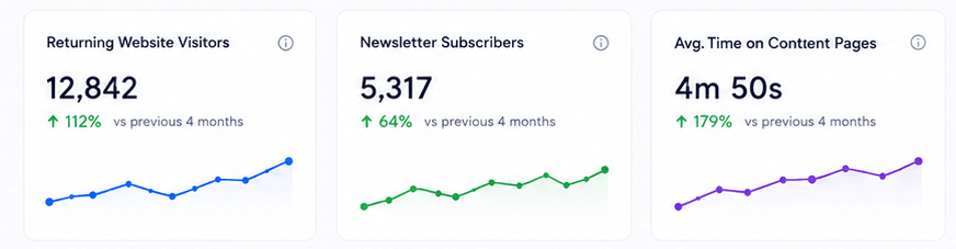
Over Time Educational content marketing Performance
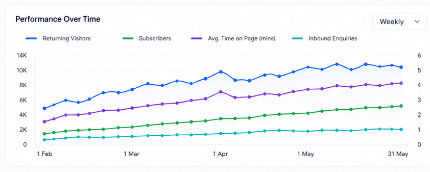
Honestly, the number that mattered most to the client wasn’t on this table at all. It was hearing, from their own advisors, that people arriving through content now showed up already trusting the advice being given, instead of sitting through a first meeting looking visibly unconvinced. That’s the kind of change that’s hard to put a percentage on, but everyone on their team noticed it pretty quickly.
Conclusion
This project really comes down to a simple, slightly uncomfortable truth content that’s obviously trying to sell you something rarely earns real trust, no matter how well it’s written. What actually moved things here was the client being willing to publish content that genuinely helped people, even when it didn’t push a product in every paragraph, even when it felt, at first, like giving something away for free. Ironically, that’s exactly what brought people back, kept them reading longer, and got them to an actual consultation already halfway convinced, because the brand had already shown it wasn’t just there to close a sale.
Want Educational content Marketing to build real trust instead of just chasing clicks?
Talk to Arihant Global about a Educational content strategy built around genuinely helping your audience first.
Why Businesses Choose Arihant Global
A lot of content marketing quietly optimizes for the pitch instead of the reader, and audiences can tell, even when they can’t quite articulate why something feels off. Arihant Global builds educational content Marketing strategies that put the reader’s actual question first, backed by real expertise and a voice people learn to trust over time. The goal was never content that gets clicked once and forgotten it’s content that brings people back, earns their trust before they ever talk to your team, and makes the eventual sale feel like an obvious next step instead of a hard pitch.
Disclaimer
Results reflect this client’s specific market and circumstances. Content marketing outcomes vary based on industry, audience, execution, and consistency, and past performance doesn’t guarantee similar results for other businesses.

How Festive Ecommerce Marketing Campaigns Increased Online Orders by 194% for an Ethnic Wear Brand

Executive Summary
Festive season for an ethnic wear brand is a bit like exam season for a student who’s put off studying all year everything that actually matters gets crammed into one short window, and if you’re not ready when it arrives, there’s no second attempt until next year rolls around. That was exactly the pressure sitting on this client. A growing ethnic wear business selling sarees, lehengas, and festive menswear, doing reasonably well the rest of the year, but watching their festive season numbers flatten out for two years running, even while the overall ethnic wear market kept growing around them.
We came in a few months before the season started to build a real festive campaign strategy, and honestly, the brief wasn’t “run some ads during Diwali.” It was closer to treating the whole lead-up as an actual campaign its own timeline, its own content, its own momentum building toward launch day instead of switching ads on the week of the festival, which is basically what they’d been doing for years.
Results Snapshot
194% Increase in online orders during the festive period
68% Growth in new customer acquisitions
3.4x Return on ad spend during the campaign window
41% Increase in average order value
Background and Context
The client had a decent website and a genuinely loyal base of repeat customers, but their festive ecommerce marketing had always been kind of last-minute a burst of ads in the two weeks before Diwali, a handful of Instagram posts, whatever inventory happened to be photographed and ready. That approach worked fine when there was less competition around. But ethnic wear got crowded fast, with newer D2C brands treating festive season as the single biggest push of their entire year, planning months out with proper content calendars and early-access campaigns.
This client, in comparison, was basically showing up to the party right as it started, while everyone else had spent weeks building anticipation before the doors even opened. By the time this brand’s ads went live, customers who might have bought from them were already three scrolls deep into a competitor’s collection reveal.
The Challenges
Once we sat down and actually mapped out what had happened in previous seasons, a few gaps stood out fast. There was zero early anticipation-building no teasers, no “something’s coming” posts, nothing to get loyal customers excited before the sale technically started. Product photography and content usually weren’t ready until uncomfortably close to launch, which meant ads went out looking rushed and inconsistent instead of the polished festive aesthetic customers expect from brands in this space. Nobody had ever really separated new customers from returning ones everybody got the same generic “festive sale is on” message, whether they’d bought five times before or never heard of the brand. ecommerce Marketing and inventory weren’t talking to each other either, so ads regularly drove traffic to products that sold out within a couple of days, which is about as wasteful as ad spend gets. And there was no real retargeting for people who browsed a lot but didn’t buy right away, which during festive season, when everyone’s comparing five brands at once in the same tab, is a genuinely huge miss.
Approach and Strategy
Phase 1: Building the Timeline Way Earlier Than Usual (Days 1–15, roughly ten weeks out)
Instead of starting a couple of weeks before the festival like every year before, we laid out a full campaign calendar starting about ten weeks ahead a teaser phase, an early access phase, the peak sale window, and a final push in the last few days before the festival itself. Having all of that mapped out early meant every later phase had something to build toward, instead of everyone scrambling reactively the way they always had.
Phase 2: Getting Content Ready Before the Pressure Hit (Days 10–35, overlapping)
We worked with the client to get product photography shot well ahead of time, styled specifically around the new festive collection instead of reused catalog shots. Sounds like a small thing, but festive shoppers are extremely visual, and content that actually looks festive versus content that just looks like a regular product photo made a real, visible difference once campaigns went live.
Phase 3: Building Anticipation Before the Sale Even Opened (Days 25–45)
About four or five weeks out, we started a teaser campaign aimed specifically at existing customers and warm audiences sneak peeks of the collection, early access sign-ups, countdown content leading up to launch day. This was the piece that had been completely missing before. It gave the client’s most loyal customers an actual reason to show up on day one instead of drifting in whenever they happened to remember.
Phase 4: Speaking Differently to New vs. Returning Customers (Days 35–70, overlapping)
Instead of one generic sale announcement going out to everyone, we built two separate tracks early access and loyalty-driven messaging for returning customers, and a more discovery-focused, first-impression campaign for people who’d never bought from the brand before. Each group needed a genuinely different reason to click, and treating them identically had quietly been leaving money on the table for a couple of seasons already.
Phase 5: Making Sure Ecommerce Marketing and Stock Were Actually Talking (Days 40–75, overlapping)
We worked closely with the client’s inventory team to make sure ad budget was going toward products that could actually keep up with demand, instead of pushing traffic to things that would sell out in two days and leave that spend working for nothing. That meant checking in regularly and shifting focus as stock levels moved throughout the season.
Phase 6: Chasing the People Who Browsed But Didn’t Buy Yet (Days 50–85)
Festive shoppers almost never buy on the first visit they compare, they screenshot, they come back a few days later once they’ve made up their mind. We built a proper retargeting sequence for anyone who’d browsed without purchasing, with messaging that shifted as the festival got closer, building a genuine sense of urgency in the last few days without it feeling like a fake countdown clock.
Results
| Metric | Before | After |
| Online orders during festive window | Baseline | +194% |
| New customer acquisitions | Baseline | +68% |
| Return on ad spend | 1.9x | 3.4x |
| Average order value | Baseline | +41% |
| Products selling out within 3 days | A recurring problem | Rare, and mostly intentional |
| Repeat customer early-access orders | Never really tracked before | 22% of total festive orders |
194% Increase in online orders and 68% Growth in new customer acquisitions
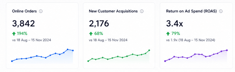
Online Order performance over time

What actually caught the client off guard was how much of the surge happened before the “real” sale even began. That teaser and early-access phase alone brought in a meaningful chunk of orders from customers who clearly didn’t want to risk missing their size or waiting around. That’s revenue that simply hadn’t existed in past seasons, because nothing before launch day had ever given anyone a reason to pay attention early.
Conclusion
This one really comes down to treating festive season like the campaign it actually deserves to be, instead of a rushed two-week sprint bolted onto business as usual. Building anticipation weeks ahead, having content ready before the pressure hit, talking to loyal customers differently than first-time visitors, keeping Ecommerce marketing and inventory in sync, and following up with people who browsed but hadn’t bought yet none of that is complicated on its own. But doing all of it together, and starting early enough for it to actually land, is what turned two flat festive seasons into the biggest one this business had ever had.
Want your next festive season to feel less like a scramble and more like a real plan?
Talk to Arihant Global about building a festive campaign that starts early enough to actually work.
Why Businesses Choose Arihant Global
Festive Ecommerce marketing for ethnic wear isn’t just about switching ads on during the sale it’s about building anticipation ahead of time, keeping Ecommerce marketing and inventory in sync, and speaking to loyal customers differently than first-time visitors, all on a timeline that doesn’t leave everything to the last two weeks. Arihant Global plans festive campaigns the way they actually need planning early, properly segmented, and tightly coordinated with what’s really in stock, so the biggest season of the year doesn’t get wasted on last-minute scrambling.
Disclaimer
Results reflect this client’s specific market and circumstances. Ecommerce Marketing outcomes vary based on product, competition, region, budget, and execution, and past performance doesn’t guarantee similar results for other businesses.
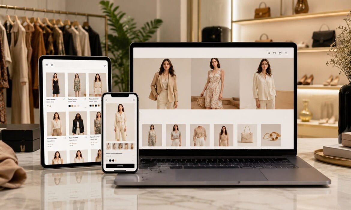
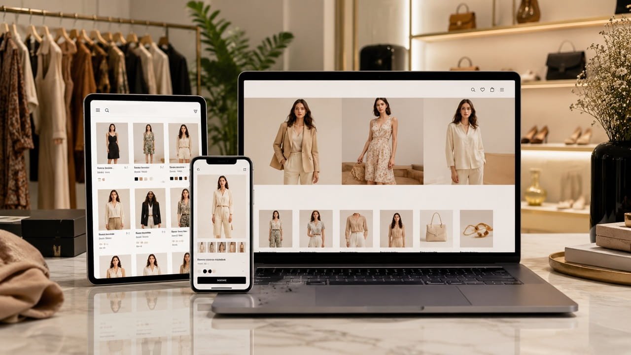
Website Development: A Fashion Storefront Rebuilt Around How People Actually Shop
Introduction
A fashion ecommerce brand asked us to look at their site expecting a conversation about visuals, a fresher homepage banner, maybe a new font. What we found instead was a store that looked genuinely good in screenshots and quietly frustrated anyone actually trying to buy something on it.
Client: Withheld at client's request

Sector: Fashion Ecommerce (D2C, Women's Contemporary Wear)

 Engagement: 5 months (build + 1 month post-launch tuning)

 Service: Website Development & Conversion Design
Background & Context
The brand ran around 350 SKUs across dresses, separates, and accessories, sold entirely direct-to-consumer, and had a site that was roughly three years old, built on a template that had been customized piece by piece over time without ever being properly reviewed as a whole. Traffic was healthy, largely from social and a growing ad account. Conversion just wasn’t keeping pace with it.
When we sat with their founder and actually shopped the site start to finish on a phone, a few things became obvious fast. Size selection required a separate popup that didn’t always load properly. Cart updates didn’t reflect immediately, so people were clicking “add to cart” twice, unsure if it had worked the first time. And checkout asked for the same shipping information twice, once at cart and again at the payment step, for no clear reason anyone could explain.
Challenges
The size and fit experience was the biggest single issue. There was no consistent size chart across products, some had one, most didn’t, and the ones that existed used a generic chart not specific to that garment’s actual cut. For fashion, where fit uncertainty is one of the main reasons people abandon a purchase, this was a real gap, and it was probably driving a meaningful share of returns too, though that wasn’t something we were tracking initially.
Checkout itself had more friction than it needed. Guest checkout existed but wasn’t the default, so people were being nudged toward creating an account before they’d even decided to buy anything, a well-documented way to lose someone at the last step. Combined with the duplicate shipping form, it added up to a genuinely long path from “add to cart” to “order placed.”
Product photography was good, but the gallery only showed the product laid flat or on one model, no sense of how it looked on different body types or in motion, which left a lot of the decision-making work undone for the shopper.
And on the technical side, the site slowed down considerably during sale periods, the exact moments when speed and reliability mattered most, because the hosting setup hadn’t been built with traffic spikes in mind.
Approach, Strategy & Solution
We rebuilt the size guidance first, since it touched almost every other conversion problem downstream. Each product category got a fit-specific size chart, embedded directly on the page rather than behind a popup, along with a short fit note where relevant, “runs slightly fitted, size up if between sizes,” the kind of practical detail that actually reduces hesitation instead of just decorating the page.

Checkout got compressed into a single page with guest checkout as the default, account creation offered only after the order was placed, not required beforehand. We removed the duplicate shipping entry and added a persistent order summary so people could see exactly what they were paying for at every step, rather than discovering shipping costs for the first time at the very end.
Product galleries got expanded to include on-model shots where the brand had them, and we worked with their photography team to prioritize at least one on-model image per new product going forward, since it wasn’t going to fix itself without becoming part of the actual production process.
We also moved hosting to infrastructure built to handle traffic spikes without degrading, tested specifically against the load levels their previous sale periods had shown, so speed held steady instead of falling apart exactly when it mattered most.
Results
Five months to build and launch, then a month of tuning based on real shopper behavior once traffic started flowing through the new flow, including one sale period that served as a genuine stress test.
Result Summary
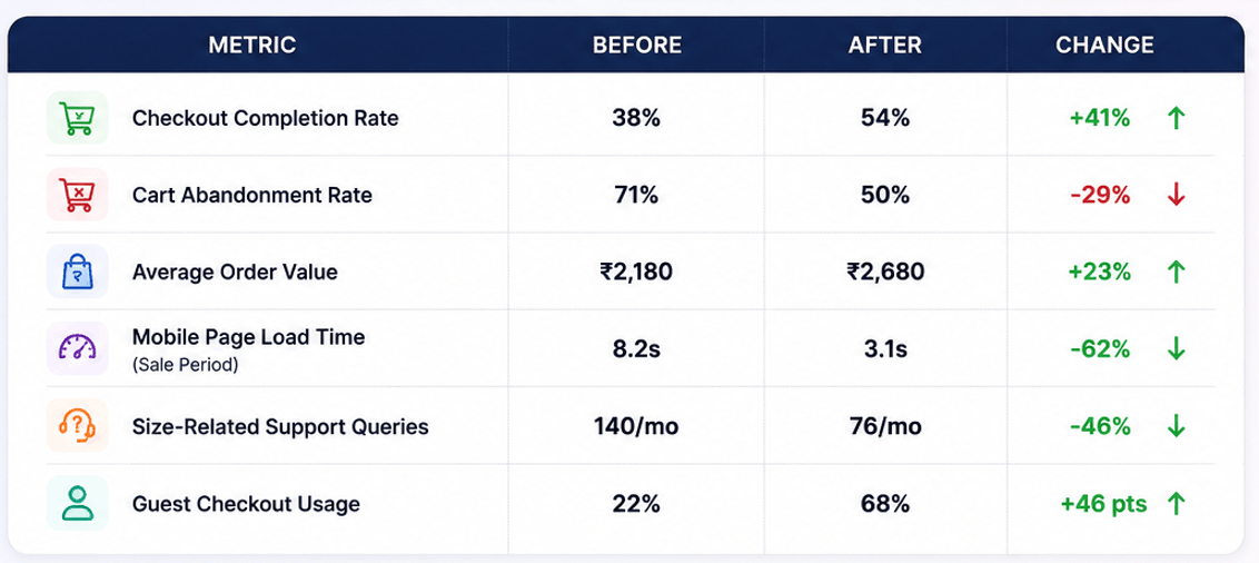
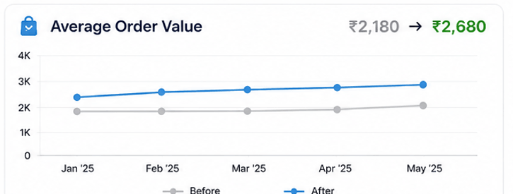
We Increased Average Order Value by 23%
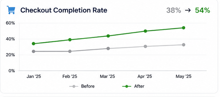
We Increased Checkout Completion Rate 38% to 54%
We Reduced Cart Abandonment by 29%
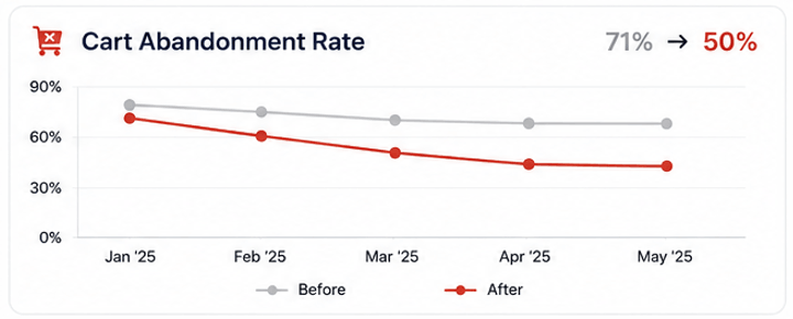
We Improved Mobile Page Speed by 62%

Their customer support lead mentioned that fit-related questions, which used to be one of the most common message categories, dropped off noticeably within the first few weeks, and that the ones still coming in tended to be about specific edge cases rather than basic confusion about what size to order.
Conclusion
The site wasn’t ugly and it wasn’t broken in any way that would show up in a quick glance. It was just full of small, accumulated friction, an extra popup here, a duplicate form field there, a missing size chart on this one category, none of it dramatic on its own, all of it adding up to people quietly giving up before finishing a purchase they’d already decided to make.
Curious What This Would Look Like for Your Brand?
We’ll walk through your current checkout and product experience for free, no changes made, just an honest look at where shoppers are actually getting stuck.
Ask us for a free ecommerce UX audit →
Why Fashion Brands End Up Working With Arihant Global
We shop your own site the way a real customer would before we touch anything. Fit and sizing get treated as a conversion problem, not just a content afterthought. Checkout gets built around fewer steps, not more fields to collect. And we’d rather fix the friction nobody’s noticed yet than redesign a homepage that was never really the problem.
Disclaimer
This case study highlights the outcomes of a specific website development project. Results may vary based on factors such as business goals, market conditions, website structure, audience behavior, technology platform, and ongoing optimization efforts.

Industrial Lead Generation: Manufacturing Company Generated Enterprise Enquiries at Scale

Introduction
An industrial equipment manufacturer came to us with a problem that doesn’t get talked about much outside B2B manufacturing circles: their sales team was excellent at closing deals once they got in front of the right buyer, but almost nobody was finding the company online in the first place. Trade shows and a decades-old distributor network had carried the business for years. That model was starting to show its age.
Client: Withheld at client's request

Sector: Industrial Manufacturing (Custom Material Handling Equipment)

Engagement: 8 months Service: Industrial Lead Generation
Background
The company manufactures custom material handling equipment, conveyor systems, automated sorting lines, that kind of large-scale industrial hardware, sold primarily to mid-size and large manufacturing and logistics operations. They’d been in business for over two decades, with a genuinely strong engineering reputation among people who already knew them. New business, though, still ran almost entirely through trade show relationships and a network of regional distributors, a model built for a slower era of industrial procurement.
The shift that had actually changed the ground under them was that procurement teams at target companies were now doing serious research online before ever contacting a distributor or attending a trade show, often building a shortlist of two or three vendors before a single phone call happened. If the company’s website and search presence weren’t part of that early research phase, they were simply never making it onto the shortlist, no matter how good the equipment or the eventual sales conversation would have been.
Challenges
The website functioned more as a digital brochure than anything built to generate a serious enquiry. Product pages showed equipment photos and basic specs but gave a procurement engineer almost nothing to actually evaluate against, no load capacity ranges clearly stated, no customization options laid out, no case studies showing the equipment solving a problem similar to their own.
Search presence for the specific, technical terms industrial buyers actually use, things like “automated conveyor system for palletized loads” or “custom sortation line manufacturer,” was close to nonexistent. The company ranked reasonably for its own name, which meant almost nothing, since a procurement team building a shortlist wasn’t searching for a brand they’d never heard of.
There was also no distinction on the site between someone doing early-stage research and someone ready to request a quote. Every path led to the same generic “Contact Us” page, which is a mismatch that costs more in industrial sales than most categories, since the sales cycle here often runs six to twelve months and different stages need genuinely different information.
And critically, there was no system for capturing and following up on the RFQ (request for quote) enquiries that did come in. Detailed technical enquiries were landing in a general inbox alongside spam and vendor pitches, sometimes sitting for days before the right engineer even saw them, which is close to fatal when a competitor’s sales team responds within hours.
What we changed
We rebuilt product pages around the actual technical evaluation criteria a procurement engineer uses, load capacities, throughput rates, integration compatibility with existing systems, and customization ranges, alongside case studies organized by industry application rather than generic testimonials. A logistics company evaluating sortation equipment wants to see a similar logistics deployment, not a vague quote about customer satisfaction.
Search strategy shifted toward the specific technical terms and use-case phrases industrial buyers actually search, which meant working closely with the company’s own engineers to understand the real vocabulary of the buying process, terms a marketing team alone would never have guessed accurately. This content also served a second purpose during the sales process itself, since reps started sending prospects directly to specific technical pages instead of a generic PDF spec sheet.
We built a distinct RFQ pathway, separate from general contact, with a structured intake form asking for the specifics an engineer would actually need to give a meaningful initial response, application type, required capacity, timeline, and existing system constraints. This meant sales engineers could review a genuine enquiry before the first call instead of starting from a blank page.
On the response side, we set up automated routing so RFQ submissions went directly to the right regional sales engineer within minutes rather than sitting in a shared inbox, along with an internal target for first response time. This wasn’t a marketing fix exactly, but it mattered as much as anything else we did, since a well-generated lead that sits unanswered for three days is functionally the same as no lead at all.
We also built targeted LinkedIn campaigns aimed specifically at procurement and operations roles within the company’s core target industries, paired with case study content, since a chunk of the buying committee for equipment this size includes people who are influencing the decision without ever filling out a form themselves.
Result
Over eight months, monthly enterprise enquiries rose from roughly 24 to 76, a 215 percent increase, with a meaningfully higher share qualifying as genuine RFQs rather than general information requests. Cost per enquiry dropped 33 percent as search traffic shifted from broad, low-intent visitors toward people actively evaluating equipment for a specific application. RFQ-to-quote conversion rate rose 58 percent, largely a function of the intake form finally giving sales engineers what they needed to respond meaningfully on the first contact.
Result Summary
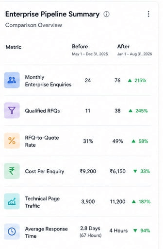
We Increased Enterprise Enquiries by 215% and We Reduced Cost Per Enquiry by 33% and Improved RFQ-to-Quote Conversion Rate by 58%
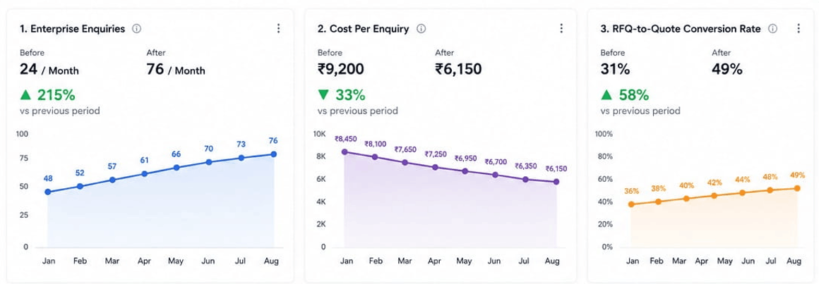
We Reduced First Response Time by 94%
We Increased Organic Traffic to Technical Pages by 187%
We Shortened the Sales Cycle by 15%
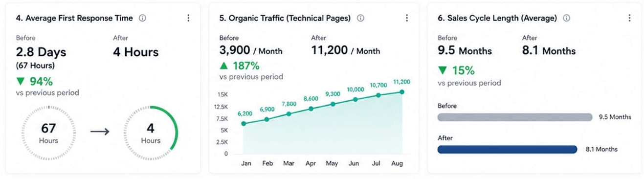
Enterprise Enquiries Trend Over 8 Months
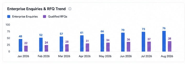
The drop in sales cycle length wasn’t something we set out to fix directly, but it tracks with what changed. Prospects arriving with a well-defined RFQ, already having reviewed technical specs and relevant case studies on the site, needed fewer rounds of back-and-forth before a real quote could be built, compared to earlier enquiries that often started from a much vaguer starting point.
“We used to find out who was seriously considering us the same way we always had, at a trade show booth or through a distributor call. Now our engineers are getting detailed RFQs from companies we’ve genuinely never spoken to before, with enough information in the first message to actually start scoping the job. That’s a different kind of pipeline than what we had.“ – VP of Sales, client manufacturer (name withheld)
Why this worked
The company’s core problem wasn’t product quality or sales skill, both were already strong. It was that their entire growth model assumed buyers would find them through relationships built over years, while the buyers themselves had quietly shifted to doing serious research online long before any relationship began. Building content and pathways around how a procurement engineer actually evaluates equipment, and making sure a real enquiry reached the right person within hours instead of days, closed that gap without changing anything about the equipment itself.
If this sounds familiar
We’ll review your current website and enquiry process for free, no changes made, just an honest look at whether your site is actually built for how industrial buyers research today, or still built for the trade show era.
Ask us for a free industrial lead generation audit →
Why manufacturing companies tend to stick with Arihant Global
Arihant Global build content around the real technical criteria buyers evaluate, not generic product marketing. RFQ pathways get built separately from general enquiries, so your engineers get what they actually need to respond meaningfully. Response time gets treated as part of lead generation, not a separate problem for someone else to solve. And we learn your actual buyer’s vocabulary from your own engineers, not from guessing at industry keywords.
Disclaimer
Results shown are based on a specific manufacturing client’s circumstances, market conditions, sales process, and implementation. Individual outcomes vary, and past performance does not guarantee similar future results.

Paid Marketing: How a SaaS Startup Reduced Cost Per Demo by 48%

Introduction
A seed-to-Series-A SaaS startup came to us with a spreadsheet that told an uncomfortable story. Every month, their cost per booked demo crept up a little further, and every month, the founders had the same conversation about whether to just cut paid spend entirely and go back to pure outbound. Nobody wanted to say the ads weren’t working. The numbers were saying it for them.
Client: Withheld at client's request

Sector: B2B SaaS (Project Management for Creative Agencies)

Engagement: 5 months Service: Paid marketing (Google Ads + LinkedIn), Demo Funnel Optimization
Background
The company builds project management software specifically for creative agencies, a narrower niche than generic PM tools, which was actually one of their real advantages. The problem was their acquisition strategy didn’t reflect that focus at all. They were running Google Ads against broad terms like “project management software” and “team collaboration tool,” competing directly against Asana, Monday, and half a dozen well-funded generalists with budgets they couldn’t match.
By the time they reached out, cost per demo had climbed past what their finance model could sustain long-term. Worse, a chunk of the demos that did get booked turned out to be poor fits, marketing agencies looking for something entirely different, freelancers who’d never pay for a team plan, people who’d clicked an ad without much sense of what the product actually did. The founders had started sitting in on sales calls themselves just to understand where things were breaking, which is a reasonable instinct but not a scalable one.
Challenges
Keyword strategy was the first issue. Bidding on broad category terms meant competing on cost-per-click against companies with ten times the budget, for traffic that wasn’t even particularly qualified, since “project management software” gets searched by everyone from solo freelancers to enterprise IT departments.
The landing page didn’t help. Every ad, regardless of which keyword triggered it, sent people to the same generic homepage, which talked about the product in broad strokes rather than speaking directly to a creative agency’s actual pain points, client approval bottlenecks, scope creep on retainers, tracking billable hours across overlapping projects.
The demo booking form itself asked almost nothing before confirming a slot. Anyone could grab thirty minutes on a sales rep’s calendar without indicating company size, current tools, or what problem they were trying to solve, which meant reps were walking into calls blind more often than not.
And there was no real distinction between LinkedIn and Google traffic in how they were treated afterward. Someone who clicked a LinkedIn ad targeting creative agency operations directors and someone who searched a generic term on Google landed in the exact same funnel, even though they were arriving with very different levels of context and intent.
Approach and Strategy
We moved keyword strategy away from broad category terms and toward the specific language creative agencies actually use “agency retainer tracking,” “client approval workflow,” “creative project management.” Smaller search volume, considerably cheaper per click, and the people searching those terms already had the exact problem the product solved, rather than a vague sense they should look into project management tools.
On LinkedIn, we narrowed targeting to operations and account management roles specifically at agencies between 15 and 100 employees, the size range where the product’s pricing and feature set actually made sense, instead of a broader “marketing and advertising industry” targeting net that was pulling in far too wide a range of company sizes.
We built dedicated landing pages matched to each core keyword theme, so someone who searched for client approval workflows landed on a page that opened by naming that exact problem, not a generic feature list. This took real production time since it meant writing and testing several page variants rather than one, but it was the single change that moved the needle most.
The demo form got a short qualifying layer added, company size, current tool in use, and the specific challenge driving the search. Reps could see this before the call, which changed the shape of those first few minutes considerably. We also added a “why creative agencies specifically” section directly above the booking button, which functioned almost like a filter, some visitors realized at that point the product wasn’t built for their situation and left before booking, which sounds like a loss but meant reps stopped burning slots on mismatched calls.
Finally, we split post-click nurture by source. LinkedIn traffic arriving with less immediate intent, got a short email sequence before the demo push. Google traffic from bottom-funnel keyword searches, arriving already looking for a solution, went straight to a booking prompt without the extra step.
Result
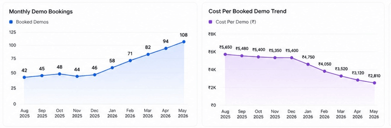
Over five months, cost per booked demo dropped 48 percent, not from cutting spend but from spending it on traffic that was already closer to a real decision. Demo booking rate rose 36 percent as landing pages started speaking directly to the visitor’s actual problem instead of a generic pitch. Show-up rate, often overlooked in funnel metrics, rose 22 percent, largely because people booking now understood what they were showing up for.
Result Summary

We Reduced Cost Per Booked Demo by 48%
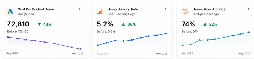
Cost Per Booked Demo Trend in 5 month
We Increased Demo-to-Trial Conversion by 13 Points and cost per click reduced 185 to 126
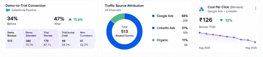
The show-up rate improvement mattered more than it might look on paper. Every no-show is a wasted calendar slot for a small sales team, and the founders had been personally absorbing some of that waste by covering calls themselves. Once that stopped being necessary, they got several hours a week back that went into actual product work.
"I used to check the ad spend dashboard the way you check a wound to see if it's healing. Now I mostly just check the demo calendar, and it's full of the right kind of company. That's a very different feeling than watching a number go up without knowing if it means anything." — Co-founder, client company (name withheld)
Why this worked
The startup’s product wasn’t the problem, and neither was their willingness to spend on acquisition. The issue was that their funnel treated every visitor identically, regardless of how they arrived or what they actually needed, which meant the budget was working against the product’s real advantage: being built specifically for creative agencies rather than everyone. Narrowing the targeting, matching the landing page to the search intent, and adding a small amount of friction to the booking form all did the same underlying thing, they made sure the people getting on calls were the people the product was actually built for.
If this sounds familiar
We’ll review your current paid Marketing and demo funnel for free, no changes made, just an honest look at whether your ad spend is chasing volume or chasing the right visitor.
Ask us for a free demo funnel audit →
Why SaaS startups tend to stick with Arihant Global
Arihant Global build keyword and targeting strategy around your actual niche, not the broad category term everyone else is bidding on too. Landing pages match the specific search or ad that brought someone there, not one generic homepage for every visitor. Booking forms are built to filter gently, not just collect. And we measure show-up rate and trial conversion alongside cost per demo, since a cheap demo that never shows up isn’t actually cheap.
Disclaimer

Home Improvement Marketing Case Study: 195% More Consultation Bookings in 5 Months

Introduction
An interior design and renovation firm came to us with a portfolio that spoke for itself, genuinely striking project photos, a strong Instagram following that clients kept complimenting them on, and a consultation calendar that never quite matched the attention the work seemed to be getting. Their creative director summed it up on our first call: “People love what we post. They just don’t seem to book anything after.”
Client: Withheld at client's request

Sector: Home Improvement (Residential Interior Design & Renovation)

Engagement: 4 months Service: Home Improvement Marketing
Client Background
The firm handles full-home interiors and partial renovations, mostly for homeowners in the mid-to-premium segment, with a small in-house design team and a network of contractors for execution. They’d built a genuinely strong visual brand over about four years, the kind of Instagram feed that gets saved and shared, real engagement, real compliments in the comments. The gap was that almost none of that admiration was converting into an actual consultation booking, which is the only thing that eventually turns into a signed project.
When we looked at their funnel, the disconnect became clear fast. Their content was optimized entirely for being liked and shared, moody photography, aspirational styling, the kind of posts that perform beautifully as inspiration but give a homeowner no actual next step. Someone could follow the account for months, genuinely love every post, and never once encounter a clear reason or easy way to actually book a consultation.
Challenges
There was no consistent call to action anywhere in the content. Posts ended with captions about the design philosophy or materials used, rarely anything pointing toward booking a consultation, so even a genuinely interested follower had to go hunting through the bio and website to figure out what to do next.
Pricing was also a complete black box, which is understandable given how much custom renovation work varies project to project, but the total absence of any pricing context meant a lot of homeowners assumed the firm was well outside their budget before ever reaching out to check. Some genuinely qualified prospects were self-selecting out for no real reason.
The website’s consultation booking process required filling out an extensive project brief, budget range, full scope details, timeline, before securing even an initial call, which is reasonable for a firm ready to start scoping real work but far too much friction for someone who just wanted a first conversation to see if this was the right fit.
And there was no differentiation in messaging between full-home projects and smaller partial renovations, everything on the site assumed a homeowner was ready for a complete overhaul, which likely discouraged people with a more modest single-room project from enquiring at all, even though those smaller projects were a real and profitable part of the firm’s business.
Our Strategy
Every piece of content got a clear, low-friction next step added, not necessarily “book now” on every post, but a consistent, specific direction, “see the full project cost breakdown,” “check if we work in your area,” something concrete rather than a vague invitation to get in touch.
We introduced rough pricing bands directly into content and on the website, not exact quotes, which genuinely aren’t possible without a proper scoping conversation, but honest ranges by project type and size, “partial kitchen renovations typically start around X,” giving homeowners enough context to self-qualify with confidence instead of assuming and walking away.
The consultation booking process got split into two tiers. A short initial call, requiring only basic contact information and a general sense of the project, became the primary entry point, with the detailed project brief pushed to after that first conversation rather than before it. This meant far more people were willing to take the first step, since committing to a fifteen-minute call feels very different from committing to filling out a full project brief with a company you’ve never spoken to.
We also built separate content and landing pages for full-home projects versus smaller partial renovations, since a homeowner wanting to redo one bathroom shouldn’t have to wade through full-home project imagery and pricing to find relevant information for their actual situation.
Instagram content got a specific new format added alongside the aspirational photography: short before-and-after breakdowns with real project costs and timelines attached, which performed noticeably better on saves and shares than the purely aesthetic posts, and gave genuinely interested homeowners the practical grounding the beautiful photography alone never provided.
Result
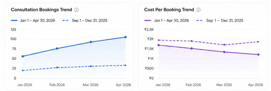
Over four months, monthly consultation bookings rose from roughly 34 to 100, a 195 percent increase, with a meaningful share coming from the smaller partial renovation segment that had barely been enquiring before. Cost per booking dropped 28 percent as the two-tier consultation process removed friction that had been quietly costing bookings from genuinely interested homeowners. Quote-to-project conversion, meaning consultations that actually turned into signed projects, rose 21 percent, largely because the rough pricing bands meant fewer consultations ended in a budget mismatch nobody had addressed upfront.
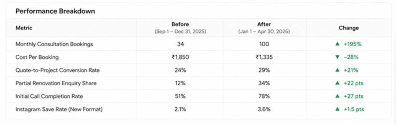
We Increased Monthly Consultation Bookings by +195% and we reduced cost per booking 28%
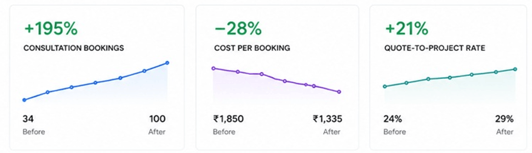
Monthly Consultation Bookings and Cost per booking trend in 4 months
The shift in partial renovation enquiries turned out to matter beyond the numbers themselves. Those smaller projects had shorter timelines and faster turnaround to a signed contract, which gave the design team a steadier stream of active work between the larger full-home projects that had previously been the only real pipeline.
"We'd built this beautiful brand and somehow made it intimidating without meaning to. People assumed we were out of reach or that reaching out meant committing to something huge. Once that friction came down, it turned out a lot of people had been wanting to work with us the whole time, they just needed an easier door in." — Creative Director, client firm (name withheld)
Why this worked
The firm’s design work and brand were never the weak point, the portfolio and following proved that on their own. What was missing was any real path from admiration to action, pricing transparency where it mattered most, a lower-friction way to take a first step, and content that gave homeowners practical grounding alongside the aspirational photography. None of it required the brand to look any different. It just needed to stop being harder to book than it needed to be.
If this sounds familiar
We’ll review your current content and booking process for free, no changes made, just an honest look at whether your funnel gives an interested follower an actual next step, or just more beautiful photos to admire.
Ask us for a free home improvement marketing audit →
Why interior and renovation brands tend to stick with Arihant Global
Arihant global build a clear next step into content, not just aspirational imagery with no direction. Rough pricing context goes in early, so qualified homeowners stop self-selecting out over assumptions. Booking gets split into a low-friction first step and a detailed brief after, not one long form before anyone’s spoken to you. And we build separate pathways for full projects and smaller ones, since treating every enquiry the same loses business you’d actually want.
Disclaimer
Results shown are from a specific client campaign and reflect that business’s unique goals, budget, market, and execution. Individual outcomes vary, and past performance does not guarantee future results.

Real Estate Lead Generation: How Facebook & Instagram Ads Increased Qualified Property Buyers by 36%

Executive Summary
Client Industry - Real Estate and Property Development
Primary Challenge
The developer had run Facebook lead generation campaigns before but the leads that came in were mostly people who had clicked out of curiosity rather than genuine buying intent. The sales team was spending hours every day calling contacts who had no memory of filling out a form or no real interest in the project. Cost per lead looked acceptable on paper but cost per serious conversation was far too high to justify continuing.
Arihant Global’s Solution
Rebuilt the Meta lead generation strategy around buyer intent signals, introduced project specific campaigns with targeted audiences, developed creative that attracted serious buyers rather than casual browsers, restructured the lead forms to include qualifying questions and introduced a follow up process that dramatically improved the rate of leads converting into actual site visits.
Key Measurable Outcomes
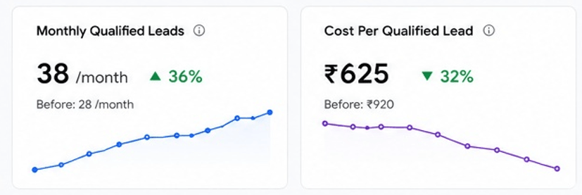
- Cost per qualified lead reduced by 32% within 4 months
- Site visit bookings from Meta leads increased by 36%
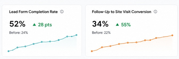
- Lead form completion rate improved by 28%
- Follow up to site visit conversion rate improved from 22% to 34%
Background and Context
The client is a residential developer with active projects across plotted development and affordable housing segments. The company had been operating for over nine years and had a sales team that was comfortable closing face to face once they had a serious buyer in front of them. Facebook and Instagram lead generation had been attempted twice before both times the volume of leads looked promising for the first few weeks and then the quality became impossible to ignore. Most contacts either did not pick up the phone, had no recollection of the project they had enquired about or were nowhere near the budget range the projects required. Management had almost written off Meta as a channel before deciding to try it one more time with a proper strategy behind it.
Challenges
- Previous Meta campaigns had generated volume but almost no leads that converted into site visits
- Lead forms were too short and asked nothing that would separate a serious buyer from someone who clicked by accident
- Ad creative was project imagery with price overlays nothing that gave a buyer a real reason to stop scrolling and engage
- Audiences were broad and based on generic real estate interests with no layering around income, life stage or specific buyer behaviour signals
- No retargeting existed anyone who engaged with an ad or visited the project page but did not fill out a form was never followed up with
- The follow up process was inconsistent leads were being called once and if there was no answer they were marked as cold and moved on from
- There was no tracking connecting Meta lead spend to actual site visits and bookings so management had no real picture of what the channel was delivering
Approach, Strategy and Solution
The work followed a structured 4 month rollout, each phase addressing a specific gap in the existing Meta lead generation setup.
Month 1 – Audit and Strategy Build
Every previous campaign was reviewed the creative that had been used, the audiences that had been targeted, the lead form questions that had been asked and what had happened to the leads that came in after they hit the sales team’s hands. The pattern was clear broad audiences, weak creative, forms that asked for nothing useful and a follow up process that gave up after one call. That review shaped the entire approach that followed, including which buyer segments to prioritize and what questions the lead form needed to ask to filter out casual interest before it reached anyone in sales.
Month 2 – Campaign Build and Creative Development
Separate campaigns were built for each active project with creative developed specifically for the buyer profile each project was targeting. Plotted development creative focused on ownership, long term value and the practical advantages of having your own plot. Affordable housing creative addressed the EMI reality, possession timelines and what the actual buying process looked like the specific things a first time buyer needs to understand before they feel confident enough to visit a site. Lead forms were restructured to include budget range and purchase timeline questions so every submission came with enough information for the sales team to immediately assess seriousness.
Month 3 – Audience Targeting and Retargeting
Cold audiences were built with multiple layers location, age range, income indicators, life stage signals and property related behaviour patterns rather than just broad real estate interests. A retargeting sequence was introduced for anyone who had engaged with an ad, watched more than 40% of a video or visited a project page without submitting a form. Retargeting creative was softer project walkthroughs, construction update videos and answers to the questions buyers typically ask before visiting rather than a direct push for contact details.
Month 4 – Follow Up Process and Optimization
A structured follow up protocol was introduced every lead called within 90 minutes of submission, WhatsApp message sent immediately as a backup and a second call attempted within 24 hours if the first did not connect. This change alone had a measurable impact on site visit conversion rates. On the campaign side, the best performing audiences and creative combinations from month three were identified and budget was concentrated there. Underperforming ad sets were paused and the saved spend was reinvested into what was actually producing site visit bookings.
Results
The shift showed up first in the sales team’s daily experience the ratio of calls that turned into real conversations changed noticeably within the first six weeks of the restructured campaigns going live.
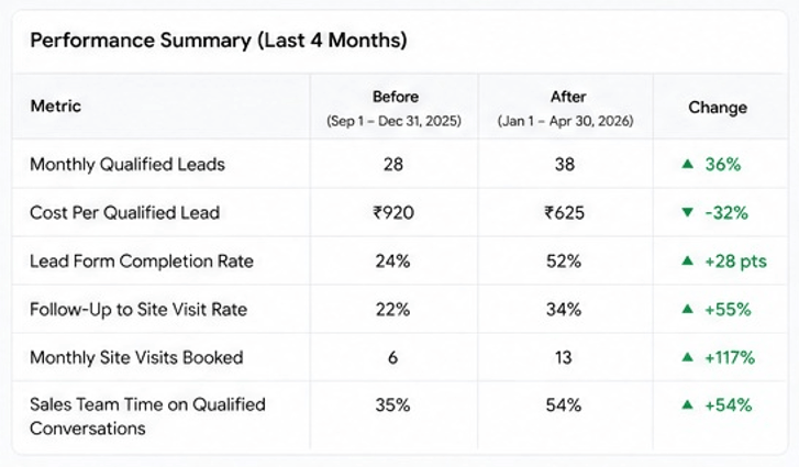
55% Improvement in Follow-Up to Site Visit Conversion (from 22% to 34%)
32% Lower Cost Per Qualified Lead (within 4 months) and 36% Increase in Site Visit Bookings (from Meta leads)
28% Higher Lead Form Completion Rate
Conclusion
Meta had not failed this developer the way the campaigns had been set up had. Broad audiences, weak creative, forms that said nothing useful and a follow up process that gave up too quickly were the real problems. When all of those things were fixed together the channel started delivering what it was always capable of. Cost per qualified lead came down by 32%, site visit bookings nearly doubled and the sales team stopped wasting half their day on contacts that were never going to convert. Facebook and Instagram work for real estate when the campaign is built around how a serious buyer actually thinks and what they need to see and feel before they are ready to visit a site.
If your property leads from Facebook and Instagram are coming in but not converting into site visits, the problem is in how the campaigns are structured and how the leads are being followed up on. Share your current Meta setup with Arihant Global and we will go through it and tell you exactly what needs to change to start generating leads that your sales team can actually work with.
Why Businesses Choose Arihant Global
Real estate developers come to Arihant Global for Meta advertising because they have usually already tried it and been let down by the lead quality. Running Facebook and Instagram campaigns for property is not about generating volume it is about attracting the right buyer at the right stage of their decision and giving them enough information and trust to take the next step. We build campaigns around buyer intent signals, develop creative that speaks to real concerns rather than just showing project renders and structure lead forms and follow up processes that turn digital interest into actual site visits. That is what makes the difference between a campaign that looks busy and one that actually sells property.
Disclaimer

How CRO Services Doubled Conversion Rates Without Increasing Traffic

Introduction
Most businesses that eventually bring in dedicated CRO services have already spent heavily on driving more traffic, only to watch conversion rate stay flat regardless of how many new visitors arrive. That’s usually not because the traffic was low quality. It’s that the site itself was never actually tested or optimized to convert the visitors it was already getting, which is exactly the gap this engagement was brought in to close.
Client Snapshot: What CRO Services Actually Walked Into
The client was a direct-to-consumer skincare brand generating around 85,000 monthly sessions through a healthy mix of paid and organic traffic, but converting at just 1.1% well below category benchmarks. Marketing had been treated as the lever to pull whenever revenue needed to grow, with the website itself largely left untouched since its last redesign. Here’s the thing about CRO services done properly the work goes well beyond swapping button colors. It involves analyzing real user behavior, running structured A/B tests, fixing friction in the conversion funnel, and tracking whether changes actually move revenue, not just a single metric in isolation.
CRO services that meaningfully move conversion rate have little patience for guesswork dressed up as optimization. Going in, this client didn’t need another traffic campaign. it needed the existing traffic converting at a rate that matched what it was already paying to acquire.
Conversion Funnel Depends on Understanding Real User Behavior First
Conversion funnel performance can’t improve through isolated page tweaks if nobody has actually diagnosed where visitors are dropping off and why. The initial analysis turned up exactly that kind of missing diagnostic layer.
- Heatmaps across key landing pages revealed visitors weren’t scrolling past the first screen on mobile, missing critical product information and trust signals entirely
- Session recordings showed repeated confusion around the product selection process, with visitors clicking back and forth between similar products without completing a choice
- Funnel analysis identified a 43% drop-off between adding a product to cart and beginning checkout, a stage that had never previously been isolated or investigated
- User behavior data showed a significant share of mobile visitors abandoning during a multi-step checkout that hadn’t been reviewed since launch
Jumping straight to testing headline variations without this behavioral diagnosis would have meant testing changes disconnected from where visitors were actually struggling.
A/B Testing Built Around Verified Friction Points
A/B testing for this client needed to be grounded specifically in the friction points the behavioral research had surfaced, rather than testing based on general best practices or internal opinion.
- Product page layout was tested against a version prioritizing key trust signals and product benefits above the fold on mobile, where the scroll data had shown the biggest drop-off
- Checkout flow was tested as a condensed single-page version against the original multi-step process, directly targeting the abandonment point the funnel analysis had identified
- Product selection was tested with a simplified comparison layout against the original grid, addressing the back-and-forth confusion the session recordings had revealed
- Each test ran to statistical significance before a winner was declared, rather than calling results early based on early, unreliable trends
The CRO Services Process Table
| Service Area | What Got Done | Impact on Conversion |
| Behavioral analysis | Heatmaps, session recordings, funnel diagnostics | Identified exactly where and why visitors dropped off |
| A/B testing | Structured tests on product, checkout, and comparison pages | Validated which changes actually improved conversion |
| Checkout optimization | Condensing multi-step checkout into a single page | Directly reduced cart-to-checkout abandonment |
| UX optimization | Mobile-first redesign of key landing pages | Addressed the scroll and engagement gap on mobile |
| CTA optimization | Testing placement, copy, and visibility of key actions | Improved click-through at critical funnel decision points |
| Ongoing monitoring | Continuous testing and performance tracking | Sustained gains as traffic and behavior shifted over time |
Checkout Optimization: The Highest-Leverage Fix in This Engagement
Checkout optimization ended up being the single highest-leverage area of this project, precisely because the original multi-step process had never been reviewed since the site’s last redesign years earlier.
- The checkout was condensed from four steps to one, removing redundant fields and consolidating shipping and payment information onto a single screen
- Guest checkout was made the default path, removing an account-creation requirement that had been quietly filtering out a meaningful share of first-time buyers
- Trust signals security badges, return policy, and shipping timelines were added directly within the checkout flow, addressing hesitation the session recordings had shown at that exact stage
- Auto-fill and address validation were implemented, reducing manual entry errors that had been causing failed submissions on mobile specifically
User Experience and Call-to-Action Optimization Across the Funnel
User experience improvements extended beyond checkout into the broader site, paired closely with call-to-action optimization at each key decision point in the buyer journey.
- Mobile-first redesign prioritized the product benefits and trust signals that heatmap data had shown were being missed entirely below the fold
- CTA copy and placement were tested across product and cart pages, moving primary buttons higher and clarifying next-step language that had previously been vague
- Product comparison simplification reduced the number of near-identical options shown simultaneously, directly addressing the indecision the session recordings had revealed
Improvements made without this kind of behavioral grounding tend to look reasonable in isolation but rarely address the actual friction losing conversions.
Results Over Four Months
Overall site conversion rate grew from 1.1% to 2.3%, more than doubling without any increase in traffic spend and Cart-to-checkout abandonment dropped from 43% to 24% following the condensed checkout implementation
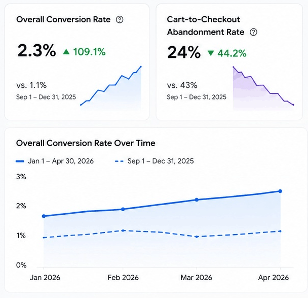
Mobile conversion rate specifically improved from 0.8% to 1.9%, closing much of the gap with desktop performance
Revenue per session increased by approximately 94%, directly reflecting the conversion rate improvement across the same traffic volume
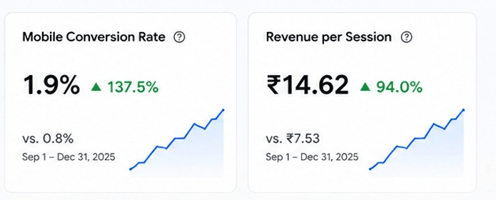
Why Ongoing CRO Services Delivered More Than a One-Time Redesign Would Have
What made ongoing CRO services worth more than a single redesign here wasn’t just the initial fixes. it’s that conversion optimization compounds through continuous testing rather than one large overhaul. A one-time redesign would have addressed a snapshot in time, based on assumptions rather than validated behavior. the ongoing testing structure kept surfacing new friction points as earlier ones were resolved, which is largely why conversion rate kept climbing rather than plateauing after the initial checkout fix.
Common Mistakes This Engagement Avoided
- Running tests based on internal opinion or general best practices, without first diagnosing actual user behavior on the site
- Focusing exclusively on the homepage while ignoring checkout, where the largest single drop-off was actually occurring
- Calling test results early based on initial trends, rather than waiting for statistical significance
- Treating desktop and mobile as equally optimized, despite mobile behavior data showing a meaningfully different experience
- Measuring success by conversion rate alone without connecting it back to actual revenue per session
Conclusion
If your traffic keeps growing but conversion rate stays flat, that gap usually comes down to specific friction points that haven’t been diagnosed or tested yet. Arihant Global works with ecommerce and DTC brands to run ongoing CRO services that turn existing traffic into meaningfully more revenue, without requiring additional ad spend. Reach out and let’s find out what’s currently costing you conversions.
Disclaimer
Results shown are from a specific client campaign and may not be typical. Outcomes vary based on industry, competition, budget, audience, and execution. Past performance does not guarantee future results.